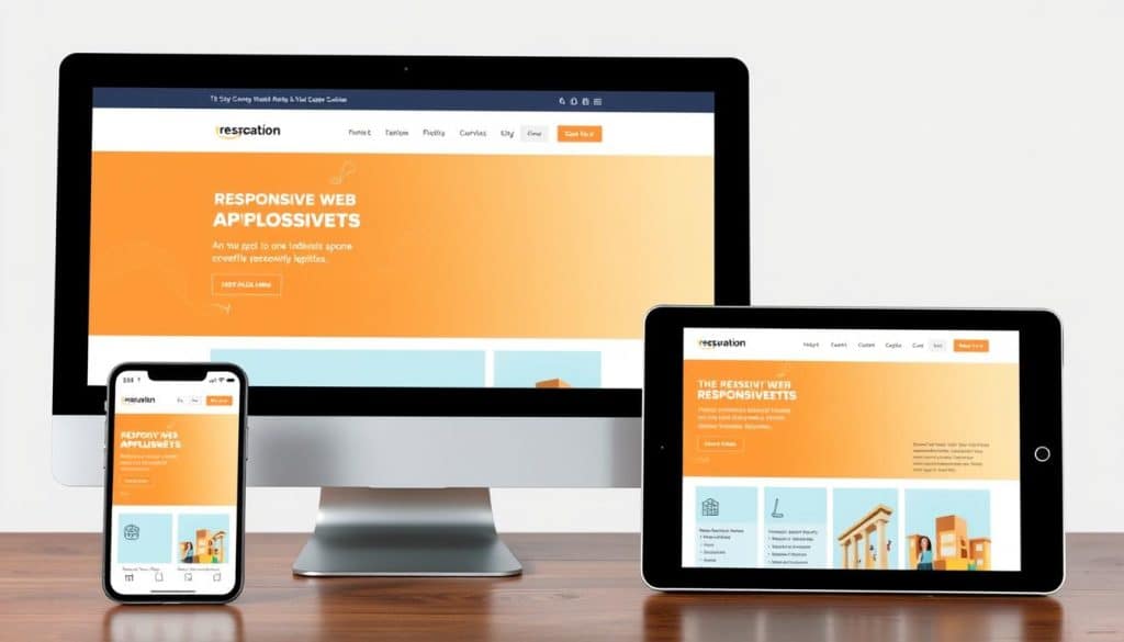
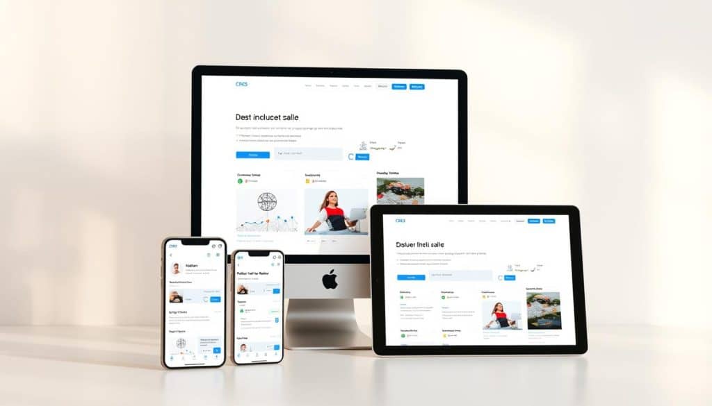
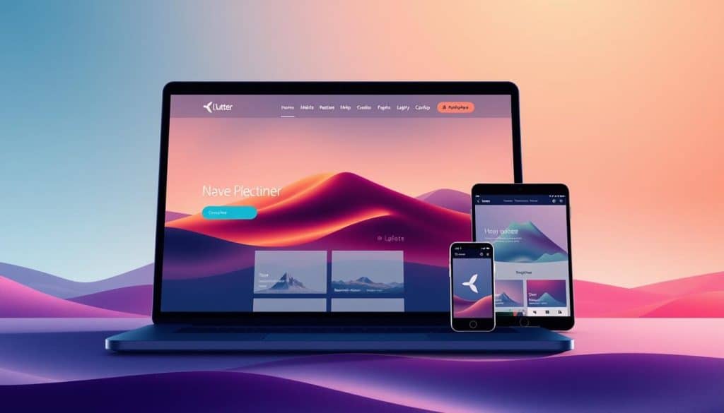
We specialize in crafting cutting-edge Flutter responsive web solutions that adapt seamlessly to any screen size, ensuring an optimal user experience across all devices. Our team of Flutter experts leverages the framework’s cross-platform capabilities to create visually stunning and highly functional web applications.
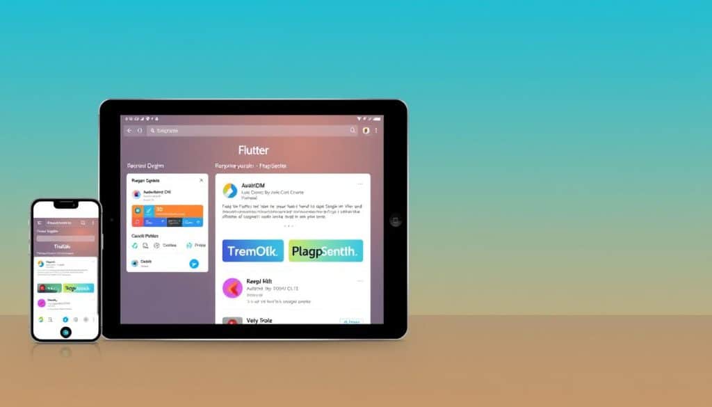
Flutter is a popular open-source mobile app development framework created by Google. Initially designed for building native mobile apps for both iOS and Android, Flutter has evolved into a powerful tool for developing responsive web applications. One of Flutter’s key features is its ability to create a consistent user experience across different platforms, including web, mobile, and desktop.
- We deliver cutting-edge Flutter responsive web solutions that adapt seamlessly to any screen size, ensuring optimal user experience across all devices.
- Our team of Flutter experts leverages the framework’s cross-platform capabilities to create visually stunning and highly functional web applications.
- Flutter’s single codebase approach allows us to develop responsive web applications more efficiently, reducing development time and costs for our clients.
- We implement responsive design principles that ensure your web application looks and performs flawlessly on desktops, tablets, and mobile devices.
- Our Flutter responsive web development services help businesses in Qatar establish a strong digital presence with applications that deliver consistent experiences regardless of the viewing device.
By choosing our Flutter web development expertise, you gain access to solutions that combine native-like performance with responsive design principles. We focus on creating Flutter web applications that not only look great but also drive business growth through enhanced user engagement and conversion rates.
Understanding Flutter for Responsive Web Development
When it comes to creating responsive web applications, Flutter stands out as a top choice. We leverage Flutter’s capabilities to build web applications that run seamlessly across various devices and screen sizes.
Flutter’s web support is a game-changer for businesses looking to establish a strong digital presence. The same codebase can be used to build native apps for iOS and Android, reducing development time and costs.
What Makes Flutter Ideal for Web Projects
Flutter’s comprehensive widget library allows us to create responsive web interfaces that adapt to different screen dimensions without sacrificing quality. The framework’s declarative UI approach enables our developers to visualize layouts more intuitively, resulting in more efficient development cycles.
Key benefits of using Flutter for web development include:
- Consistent UI across multiple platforms
- Native-like performance
- Faster development and iteration cycles
- Reduced maintenance overhead
| Feature | Benefit |
|---|---|
| Declarative UI | More intuitive layout visualization |
| Hot Reload | Faster development and iteration |
| Comprehensive Widget Library | Responsive web interfaces |
By utilizing Flutter’s extensive ecosystem of packages and plugins, we can enhance the functionality of your responsive website while maintaining optimal performance.
Setting Up Your Flutter Responsive Web Environment

Before diving into Flutter web development, it’s essential to configure your development environment correctly. To start developing with Flutter, you need to install the Flutter SDK on your system.
Required Tools and Prerequisites
To begin, ensure your system meets the necessary requirements: Operating System – Windows, macOS, or Linux, and at least 1.64 GB of disk space. You’ll need to download the Flutter SDK from the official Flutter website and extract it to your preferred location. Additionally, you’ll need to install an IDE like Visual Studio Code or Android Studio, along with the Flutter and Dart plugins.
Creating Your First Flutter Web Project
First, ensure you’re on the Stable Flutter channel by running “flutter channel” and switch if necessary. Check your Flutter version with “flutter -version” and upgrade if needed using “flutter upgrade”. Enable web support with “flutter config –enable-web”. Now, you’re ready to create your first Flutter web project, either through the command line or using your IDE’s project wizard. Our team guides you through this process, ensuring proper configuration and setup for a responsive web app.
Flutter Responsive Web Development Fundamentals
To create responsive web applications that adapt to different screen sizes, understanding Flutter’s core tools is essential. We implement Flutter’s core responsive tools—MediaQuery and LayoutBuilder—as the foundation for creating web applications that adapt to different screen sizes.
MediaQuery and LayoutBuilder Basics
MediaQuery provides critical device information such as screen dimensions, orientation, and pixel density, enabling precise responsive adjustments. For instance, Size size = MediaQuery.of(context).size; gives us the current screen size. On the other hand, LayoutBuilder builds a widget tree based on the parent widget’s constraints, allowing for dynamic layouts. An example of this is: LayoutBuilder(builder: (context, constraints) { if (constraints.maxWidth > 600) { return _buildWidgetContainer(); } else { return _buildNormalContainer(); } },);
Understanding Breakpoints for Different Devices
Defining specific screen width ranges for different layouts (e.g., mobile, tablet, desktop) is crucial. We establish strategic breakpoints that define how your application’s layout transforms across different device categories—from mobile phones to large desktop monitors. By mastering these Flutter responsive fundamentals, we create web applications that deliver consistent experiences regardless of whether users access them from smartphones, tablets, or desktop computers.
Implementing Responsive Layouts in Flutter
In Flutter, creating responsive layouts is key to providing a consistent user experience across different devices and screen sizes. We achieve this by utilizing a combination of specialized widgets that adapt to the available space.
Flexible and Expanded Widgets
We implement sophisticated responsive layouts in Flutter using a strategic combination of Flexible and Expanded widgets that distribute available space proportionally. These widgets are essential for creating layouts that adjust dynamically based on screen size.
Aspect Ratio and Fractionally Sized Box
Our developers leverage FractionallySizedBox to create elements that occupy precise percentages of screen width, ensuring consistent proportions across different device sizes. Additionally, AspectRatio widgets maintain proper proportions for images and video containers regardless of screen dimensions.
| Widget | Description | Use Case |
|---|---|---|
| Flexible | Distributes available space proportionally | Responsive layouts |
| FractionallySizedBox | Sizes child to a fraction of total available space | Precise screen width occupation |
| AspectRatio | Maintains specified aspect ratio for child widget | Images and video containers |
Stack and Positioned Widgets for Complex Layouts
For complex interfaces, we implement Stack and Positioned widgets to create layered layouts that adapt intelligently to different screen configurations. This approach ensures that your Flutter web application maintains visual harmony across diverse screen sizes.
For more information on implementing responsive design in Flutter, you can refer to this article that provides detailed insights into the process.
Using the Responsive Framework Package
Our approach to creating adaptable Flutter web applications involves leveraging the Responsive Framework package. This powerful tool streamlines the development process, enabling us to create applications that seamlessly adapt to various screen sizes and devices.
Installing and Configuring the Package
To start using the Responsive Framework package, we first install and configure it in the project’s pubspec.yaml file. This step ensures compatibility with the Flutter version being used. We import the library into our project by adding responsive_framework: ^latest_version.
Defining Custom Breakpoints
We define custom breakpoints tailored to specific business needs, specifying precise screen width ranges for mobile, tablet, desktop, and 4K displays. This is achieved by using ResponsiveBreakpoints.builder and defining breakpoints such as MOBILE, TABLET, DESKTOP, and ‘4K’.
Responsive Widgets and Utilities
The Responsive Framework package includes widgets and utilities that facilitate the creation of responsive layouts. We use conditional builders and specialized widgets like ResponsiveValue, ResponsiveVisibility, and ResponsiveRowColumn to create adaptive interfaces that respond to different screen sizes and devices.
Handling Images and Text Responsively
When developing Flutter web applications, handling images and text responsively is crucial for a seamless user experience across various devices. We implement sophisticated techniques to ensure that both images and text adapt to different screen sizes, maintaining the visual integrity and communication clarity of your web application.
Responsive Image Scaling Techniques
Our approach to handling images responsively involves utilizing the BoxFit property to fit images within their containers effectively. For instance, we use BoxFit.cover for background images and BoxFit.contain for content images to maintain proper aspect ratios. This ensures that images are scaled appropriately across different screen sizes. We also implement resolution-aware image loading to serve appropriately sized assets based on the device’s screen density, optimizing both visual quality and performance.
Dynamic Text Sizing for Different Screens
For text elements, we create dynamic sizing systems that scale proportionally with screen dimensions, ensuring readability without overflow issues on smaller devices. We adjust text size based on screen dimensions using MediaQuery.of(context).size.width. Our responsive text implementation includes minimum and maximum size constraints to prevent text from becoming too small on mobile devices or excessively large on desktop screens. By utilizing Flutter’s powerful text scaling capabilities, we maintain proper hierarchy and emphasis in your content across different screen sizes.
| Device Type | Screen Size | Text Scaling Approach |
|---|---|---|
| Mobile | Small | Minimum size constraint |
| Desktop | Large | Maximum size constraint |
| Tablet | Medium | Proportional scaling |
By handling both images and text responsively, we create web applications that maintain visual integrity and communication clarity regardless of the viewing device. For more information on how we drive social media engagement for businesses in Qatar, visit our page on social media engagement.
Building Responsive Navigation Systems
In today’s digital landscape, a responsive navigation system is crucial for providing an optimal user experience across various devices. We design and implement navigation systems that intelligently adapt between desktop and mobile patterns, ensuring intuitive interactions across all devices.
Desktop vs Mobile Navigation Patterns
For desktop views, we implement expanded horizontal navigation bars with dropdown menus that effectively utilize the available screen space. In contrast, on mobile devices, we transition to space-efficient navigation patterns like hamburger menus and bottom navigation bars that optimize the limited screen real estate.
| Device | Navigation Pattern | Key Features |
|---|---|---|
| Desktop | Expanded Horizontal Navigation Bars | Dropdown menus, effective screen space utilization |
| Mobile | Hamburger Menus and Bottom Navigation Bars | Space-efficient, optimized for limited screen real estate |
Implementing Drawer and AppBar Responsively
Our responsive AppBar implementations adjust their height, content density, and interactive elements based on the available screen width. We also create smooth transitions between navigation states, ensuring users maintain context when switching between device orientations or resizing browser windows. Our drawer implementations include responsive width calculations that ensure the menu occupies an appropriate portion of the screen regardless of device size.
Advanced Flutter Responsive Web Techniques
Our team leverages sophisticated approaches to develop Flutter web applications that are both responsive and visually appealing. By combining advanced techniques with a deep understanding of various devices and screen sizes, we create seamless user experiences.
Creating Responsive Grids and Cards
We implement advanced responsive grid systems that automatically adjust their column count and spacing based on available screen width, creating visually balanced layouts across all devices. Our responsive card implementations utilize flexible sizing algorithms that maintain proper proportions while resizing content to fit available space on different screen sizes.
Handling Orientation Changes
We develop orientation-aware layouts that smoothly transition between portrait and landscape modes, optimizing content presentation for each orientation. This is achieved by utilizing Flutter’s widget system to create adaptable UI components.
Testing Responsiveness Across Devices
Our testing methodology includes rigorous cross-device verification using both physical devices and emulators to ensure consistent responsiveness across the Android and iOS ecosystems. For instance, we use the carousel_slider package with responsive configurations that adjust item counts, spacing, and animation timing based on screen dimensions.
| Device Type | Screen Size | Orientation |
|---|---|---|
| Desktop | Large | Landscape |
| Tablet | Medium | Both |
| Mobile | Small | Portrait |
Conclusion: Maximizing Business Growth with Flutter Responsive Web
As we conclude our exploration of Flutter responsive web development, it’s clear that this technology offers unparalleled opportunities for businesses in Qatar to thrive in the digital landscape. By leveraging Flutter’s responsive design capabilities, you can create web applications that deliver consistent user experiences across various devices, from desktop workstations to employee tablets and customer mobile devices.
Our approach to Flutter responsive web development ensures that your project is future-proof, scalable, and optimized for different screen sizes and widths. This not only enhances user engagement but also drives revenue growth through digital excellence. By partnering with our Flutter experts, you gain access to cutting-edge responsive design implementations that keep your digital presence competitive.
Investing in Flutter responsive web development today positions your business for sustainable digital growth, with applications that adapt to both current and future user expectations, ultimately maximizing your business’s online potential.
FAQ
What are the benefits of using Flutter for responsive web development?
We find that Flutter offers a fast, efficient, and cost-effective way to build responsive web applications, allowing businesses to reach a wider audience across various devices and screen sizes.
How do I handle different screen sizes in my Flutter app?
To handle different screen sizes, we utilize widgets like MediaQuery and LayoutBuilder, which enable us to create adaptive layouts that adjust to the available screen space.
What is the role of breakpoints in responsive design?
Breakpoints play a crucial role in responsive design, as they allow us to define specific screen sizes where the layout changes to accommodate different devices, such as desktops, tablets, or mobile phones.
Can I use the Responsive Framework package to simplify my responsive design process?
Yes, the Responsive Framework package is a valuable tool that simplifies the process of creating responsive layouts by providing pre-built widgets and utilities that adapt to different screen sizes.
How do I ensure that my images and text are displayed responsively?
To achieve responsive image and text display, we employ techniques such as responsive image scaling and dynamic text sizing, which adjust the size and layout of these elements according to the screen size.
What are some best practices for building responsive navigation systems?
When building responsive navigation systems, we consider different navigation patterns for desktop and mobile devices, and utilize widgets like Drawer and AppBar to create adaptive navigation menus.
How can I test the responsiveness of my Flutter web application?
To test responsiveness, we use a combination of tools and techniques, including testing on different devices, using the Flutter debugger, and leveraging packages that simulate various screen sizes and devices.


